Enhance Your Home with These Basic Design Principles
Whether you enjoy a clean minimalist look or adore the more-is-more maximalist aesthetic, the same underlying design principles determine whether or not a room’s design ultimately works. Whatever your preferred design style, harnessing the power of these basic design principles will help you create a space that looks good.
Balance
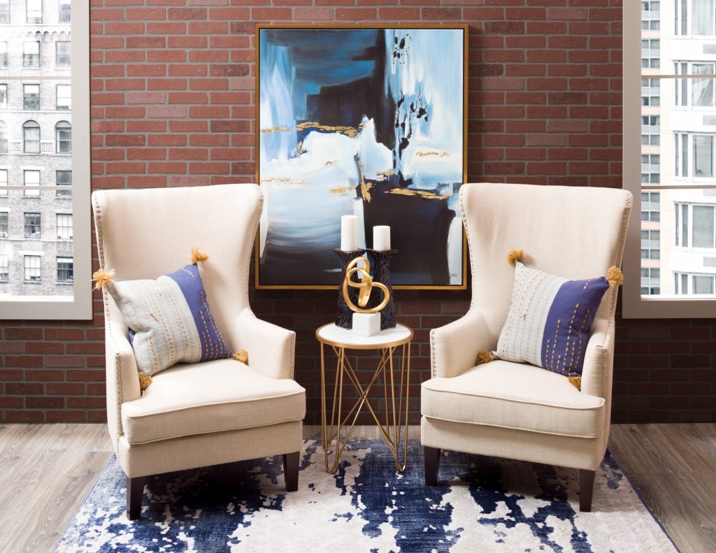
Balance deals with the idea that objects have a visual weight, and that the visual weight should be distributed evenly throughout a room to create a feeling of equilibrium. The size, color, and texture of an object dictate its visual weight: a small, pale, smooth object has less visual weight than a large, textured object that is dark or brightly colored. Balancing the visual weight of the objects in a space is important because a balanced room has a calm, pleasing feel.
One simple way to achieve equilibrium is through symmetry, mirroring objects on either side of an imaginary central axis. This is very easy to achieve and gives a space a more traditional or formal look. In this space we used mirror symmetry to create a somewhat formal, structured look. The wall art, accent table, abstract sculpture, and rug are lined up along a central axis while the chairs, accent pillows, and candles mirror each other across the axis to create symmetry. A variation on mirror symmetry, radial symmetry repeats elements around a central point instead of a central axis—think dining chairs arranged around a round table or arm chairs arranged in a circle to create a conversation area. A third type of balance, called asymmetrical balance, deliberately avoids symmetry and creates an intentionally unbalanced look to generate interest through the unexpected visual. It’s tricky to pull off and works best in modern spaces thanks to its edgier feel.
Rhythm
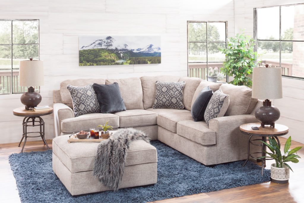
Rhythm is the creation of a pattern through repetition and contrast of elements like shape, color, texture, or material in a regular way throughout a space. It helps to create visual interest, lead the eye around a room, and produce a feeling of continuity. In this room, we repeated the blue from the rug in the navy accent pillows on the sectional and the blue of the mountains in the wall art so that the eye travels from the rug to the sectional then to the wall art. We also incorporated greenery throughout the room with the forest in the wall art, the faux tree in the corner, and the plant on the floor. Depending on your view inside the room, both the pops of blue and the greenery create a roughly triangular shape, which also gives this room a sense of balance.
Harmony and Unity
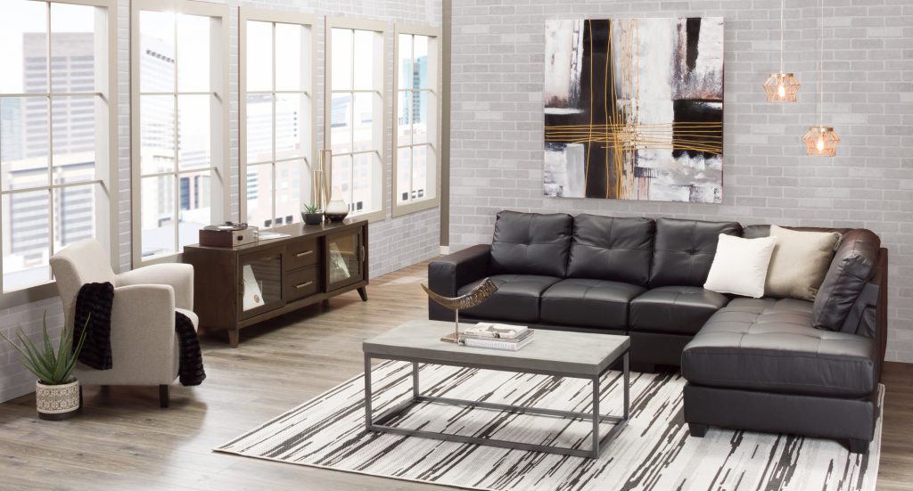
Harmony is the idea that the different elements in a room should coordinate with each other, while unity is the idea that everything should work together to create a cohesive whole. Together, these two principles dictate whether or not pieces in a space look intentionally chosen. You can create unity in a space by repeating colors, materials, shapes, and textures throughout.
In this room, we used the contemporary, geometric look of the white windows and the grey brick walls as a starting point that we kept in mind when choosing furniture for the space. We started with a black sectional with a geometric silhouette, then incorporated a contemporary geometric cocktail table and a mid-century wooden console to echo the structured, rectangular silhouette throughout the room. While unity is important in a space, adding in a little variety is crucial to keep it from feeling boring. We switched things up by adding in a curved horn accessory and a white arm chair that pairs the same clean lines of the rest of the room with a curved back and arms for a softer look. Aside from choosing furniture with strong geometric silhouettes, we also selected accessories that fit in with our predominantly monochromatic color scheme, including a grey and white striped rug and white, gray, and black wall art.
Emphasis and Focus
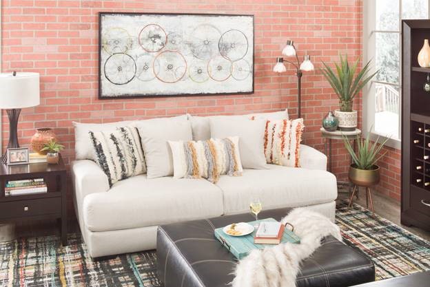
Emphasis and focus deal with the idea that objects in a space should have a hierarchy of visual importance based on how much they draw they eye. The most visually important thing or area in a space is called a focal point. A room needs a focal point because without a focal point a space feels boring and thrown together. Most rooms have a built-in architectural focal point, like a fireplace or window with a great view; if a room doesn’t have an architectural focal point, you can create one with artwork, a statement piece, or by grouping furniture together. A sofa with a piece of art hung on the wall above it is a classic way to create a focal point in a room, as is pairing a small table with a piece of dramatic artwork. Whatever your focal point, the furniture in a room should be arranged around it to emphasize its place at the top of the room’s hierarchy of importance. In this space, we created a focal point by choosing a light-colored sofa and then hanging a large, light-colored piece of art above the sofa. The light sofa and artwork contrast with the dark furniture in the room to draw the eye.
Any well-designed space combines the same basic design principles. Regardless of your preferred design style, employing the principles of balance; rhythm; harmony and unity; and emphasis and focus in your home will enable you to create a space that looks great.
Bio of writer: Rachel Sellers is a Content Writer for American Furniture Warehouse, one of the nation’s top furniture retailers with a large selection of affordable furniture and home decor. American Furniture Warehouse has more interior design tips, how-to guides, inspiring looks, and other design and lifestyle topics on the American Furniture Warehouse blog.
By: Rachel Sellers, Content Writer, American Furniture Warehouse


